Suddenly discovered! Essential secrets for official website construction, even ordinary people can handle it!
Select several representative big brand clothing websites to share with everyone one by one:

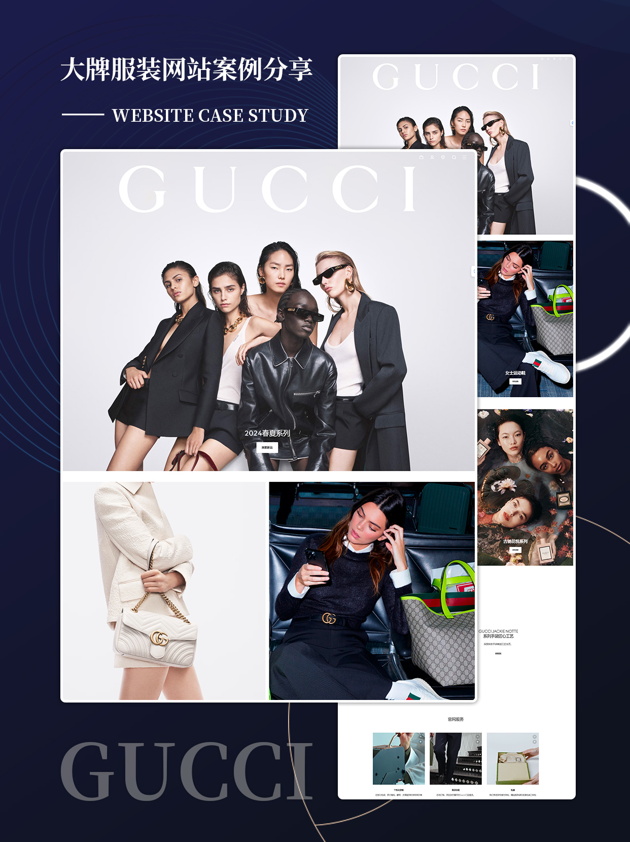
1. The overall design of Gucci's official website is great, and the overall color scheme of Tuhao Gold is consistent with its brand style, exquisite and luxurious. Grinding a knife does not harm the woodcutter. Without a brand's visual recognition system, it is recommended to first make a rough decision, such as the brand's base color, so that subsequent design work can proceed scientifically.
2. NIKE: Compared to the narrow version of Adidas official website, I prefer the wide version of NIKE official website, which means that when the browser is maximized, there is no blank space on both sides, and the wide version appears more atmospheric.
3. MUJI: The homepage of MUJI's official website has no dynamic effects, and when hovering over the mouse, only a system hyperlink gesture appears. The entire website and brand tone are consistent: simple and quiet.
The reason for mentioning this point is because I feel that some novice designers prefer websites with dot effects, such as triggering dot animations when hovering over a certain image. In my opinion, if we pursue quality, generally speaking, the fewer interactive effects on the homepage, the better. Most luxury brands have very few interactive effects on their official websites.
4. JOHN LOBB: The fewer interactive effects on the homepage, the better. What about other pages? I think John Lobb (a brand under Herm è s) has done a great demonstration.
The pages of "Man", "Woman", and "As Required" in front of John Lobb are all static, except for the hovering trigger animation. When it comes to the "Customization" and "Exploration" section pages, as the page moves downwards, images appear slowly, and when the mouse hovers, video animations automatically play, making it feel that these section pages are somewhat different from the previous section pages, and also making the mood of website visitors more lively. I think this should be the application of the "contrast" principle in design. If all pages are static, the entire website may appear stiff.
For example, the title image on the homepage of Apple's official website is the static banner of iPhone X. After clicking, a futuristic zoom in and out animation appears, followed by the parallax scrolling effect.
In summary, the homepage of the website should minimize animation effects as much as possible. Other pages can be designed with some minimalist animation effects according to the theme, in order to play a contrasting and prominent role.
5. PRADA: When hovering over the menu on the left, the corresponding large image is displayed accordingly, which is very atmospheric and concise. When hovering over the Prada Rongzhai in the middle, an automatically played large screen video is displayed, with a contrasting effect of being quiet and moving.
6. CHANEL: Chanel's official website is simple and elegant, and the videos and images on the "2017/18 Autumn/Winter Premium Customized Clothing Series" page ("Premium Customized Clothing" section) may not align as neatly as regular layout, but they are well arranged and give people a sense of fashion.
Victoria's Secret: It's very sexy, and the banner is impressive. If you need to highlight it or it's not easy to display it horizontally, you can learn to design Victoria's Secret.
Finally, I believe that the construction of official websites should pay attention to the following points:
The style of the official website should match the brand tone;
Try to minimize the number of animations on the website homepage, which can enhance the quality of the official website;
The non homepage pages of the official website can be designed with some minimalist dynamic effects to play a prominent role in comparison;
When designing a special topic page, you can brainstorm and try to create some creative designs;
If there is innovation in the details, it can also make visitors remember you.
For more information, please consult 17610875391. Lexi Chuangxiang Xiaolin will be happy to answer your questions.
-
Empowering the future is the only way to build mechanical websites!
-
Website construction secrets revealed! New Trends in the Cultural Industry!
-
Brand Strength MAX | Customized Official Website, Make the Brand More Warm!
-
Home Decoration Website Construction | Refinish Life!
-
Suddenly discovered! Essential secrets for official website construction, even ordinary people can handle it!
-
I regret it! Missing the latest trend in website construction in the financial industry!
-
[Must Read] Hotel Website Construction, Teach You How to Quickly Kill Competitors!
-
How to choose a high-quality website domain name? The four skills teach you.
-
How to choose a high-quality website domain name? The four skills teach you.
-
[Must Read] Hotel Website Construction, Teach You How to Quickly Kill Competitors!
-
I regret it! Missing the latest trend in website construction in the financial industry!
-
Suddenly discovered! Essential secrets for official website construction, even ordinary people can handle it!
-
Home Decoration Website Construction | Refinish Life!


